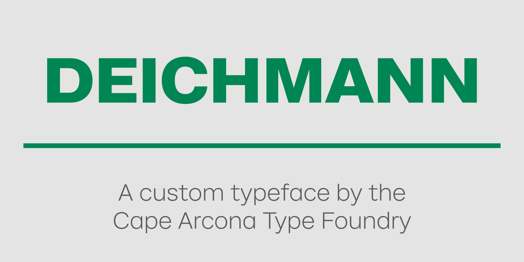
Deichmann
Custom Typeface Family
In 2011, Cape Arcona was asked to create a custom typeface for Deichmann, one of Germany’s largest shoe retailers. Initially, it was just for the uppercase letters. KW43 Branddesign had redesigned the DEICHMANN typeface for the upcoming redesign. But DEICHMANN is not always spelled DEICHMANN in all countries. Therefore, a complete capitalization alphabet had to be designed in order to derive the lettering for the branches in other countries. The result was so well received that we were soon asked to design the corresponding lowercase letters.
The goal was to create a clear, simple, timeless typeface that would transfer the character of the capital letters to the lower case.
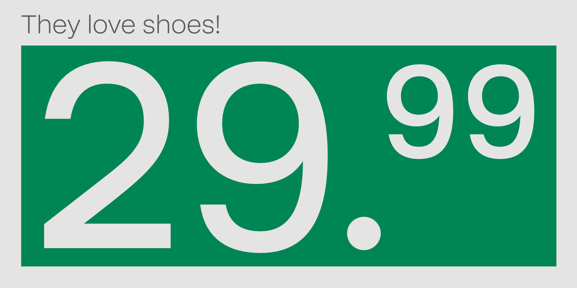
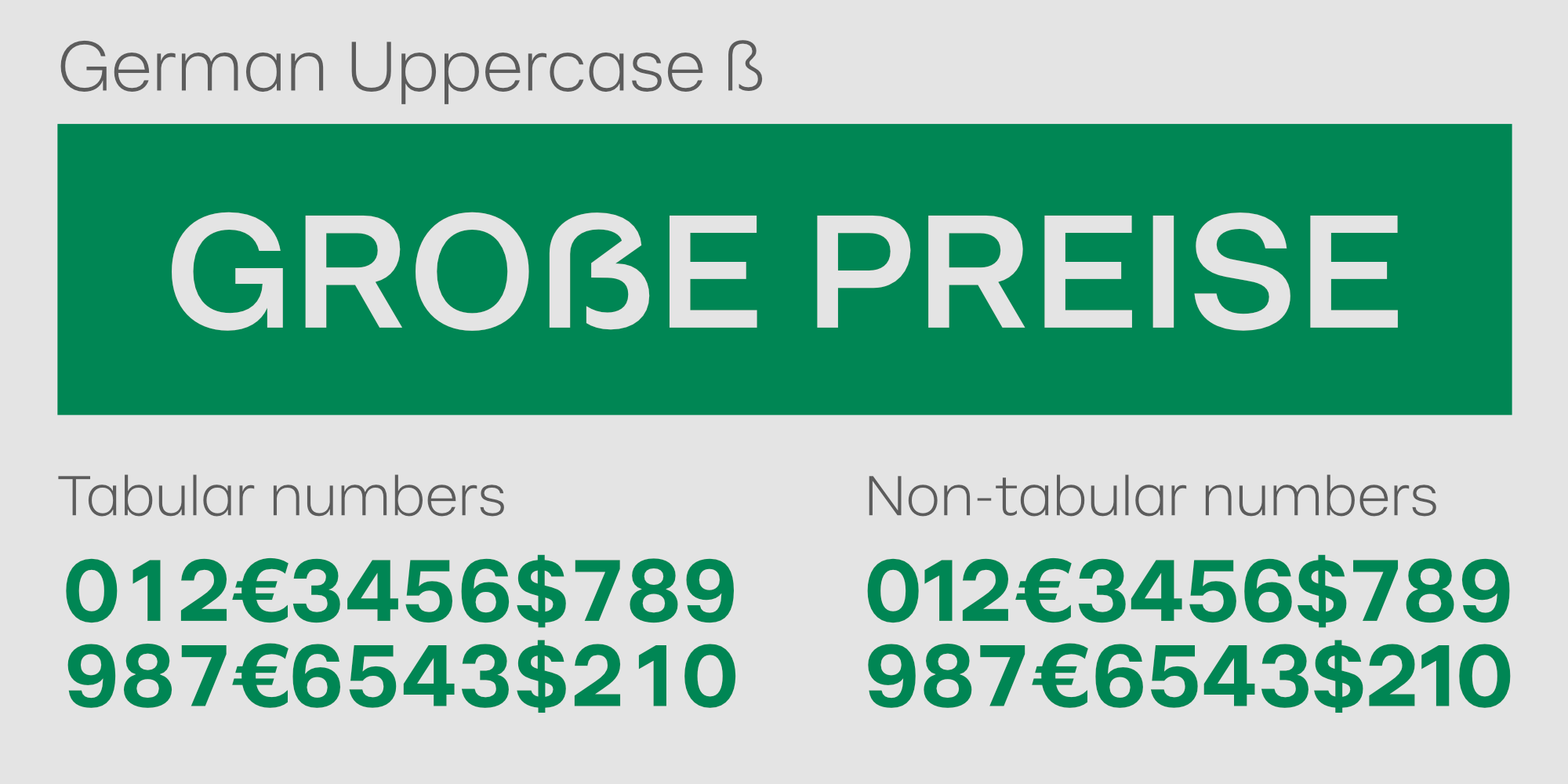
Since price labeling in stores and catalogs is a central aspect of DEICHMANN’s communication, special attention was paid to the design of the numerals.
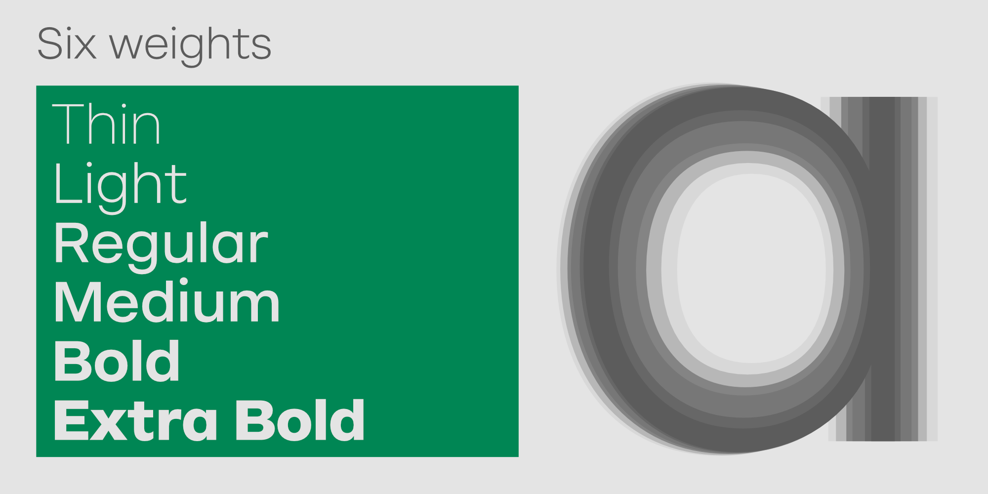
The selection of weights for the individual fonts was not based on an even distribution as in the classic waterfall, but was specially adapted to the requirements of the new corporate design (which was awarded the RED DOT AWARD, among others).
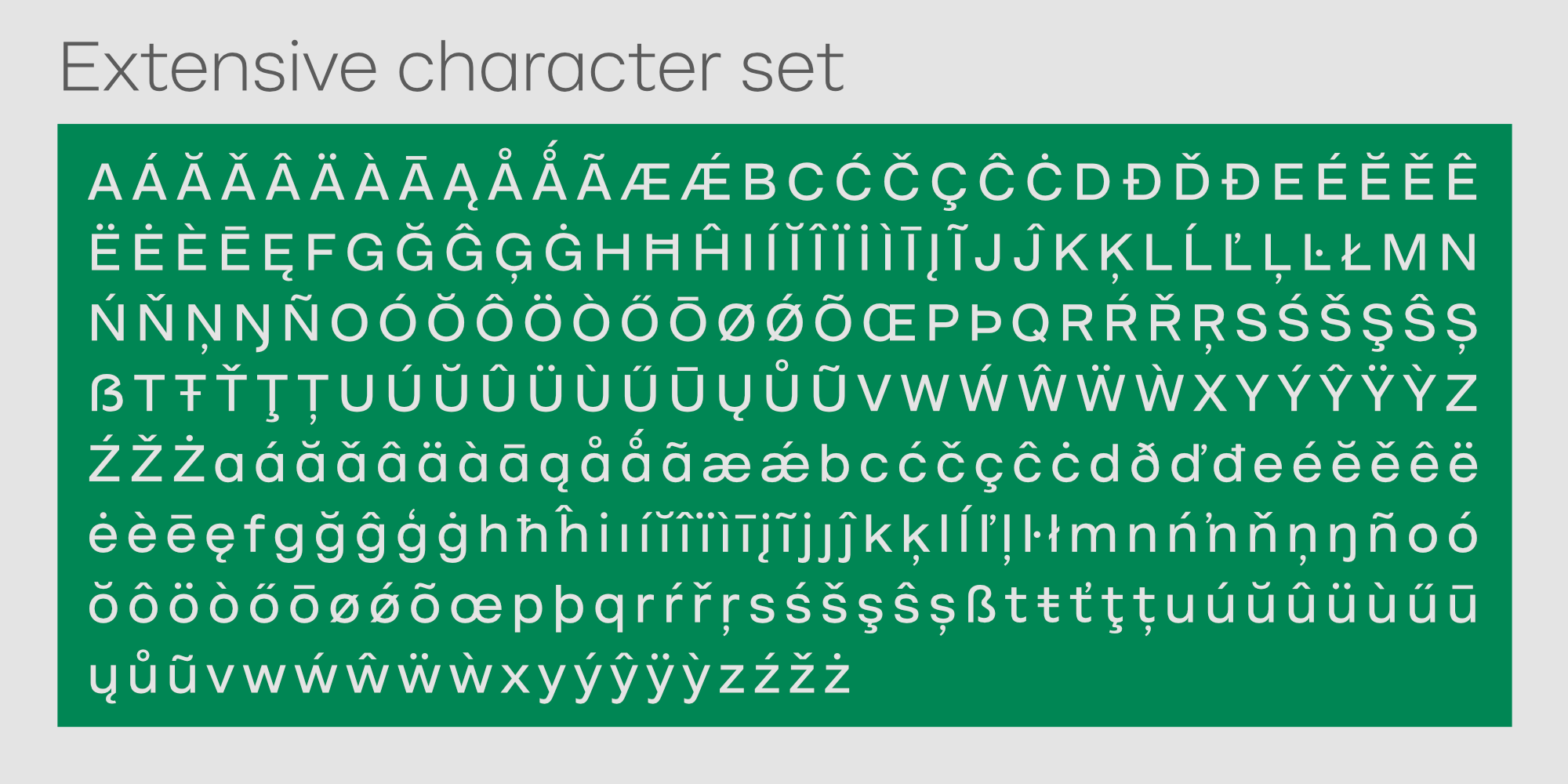
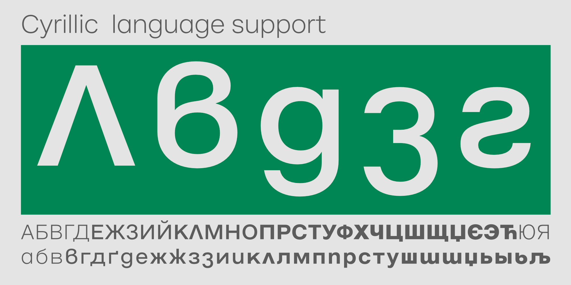
The first important addition to the original DEICHMANN typeface family was the design of a Cyrillic character set. As DEICHMANN’s Eastern European operations are focused on Bulgaria, the new characters were designed in collaboration with a native speaker to appeal to Bulgarian eyes, as there are some subtle but important differences from the otherwise much more widely used Russian Cyrillic.
In 2020, preparations began for a new redesign, and Cape Arcona was on board from the beginning. The goal was to make the typeface friendlier and more contemporary. In the course of the redesign, the arcs and inlets were reworked, the dots were rounded, and some characteristic letters were significantly changed.
There was also the idea of creating special numerals, which would be more memorable due to their uniqueness and would ensure a higher recognition value of the brand. In the end, however, these designs were discarded in favor of a simpler, more natural design language.
With the experience gained from the first typeface, other details were also optimized. For example, DEICHMANN’s commitment to the Anglo-Saxon market had increased, so shoe sizes such as 8½ or 9⅔ had to be written more frequently. Since conventional fractions tend to be too thin in small point sizes and especially in light weights, we designed special fractions that are still easy to read at 5 pt.