Traumzeit
Custom Typeface Family
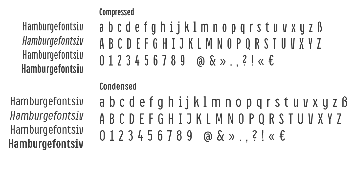
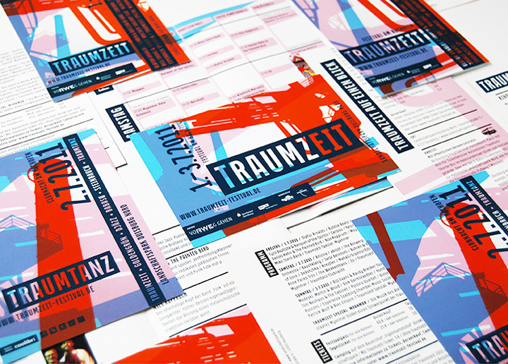
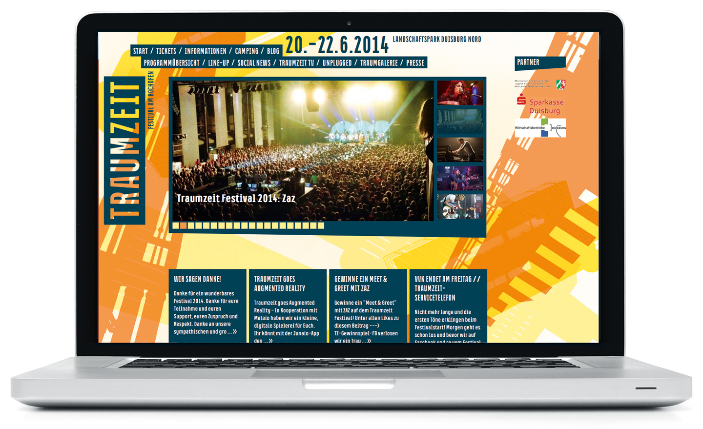
As an integral part of the new corporate identity for the Traumzeit Festival developed by Sichtvermerk, we created a distinctive yet flexible typeface. Derived from their initial logo design, we began by creating compressed capitals for headlines. When the typeface proved to work well for this type of application, it was expanded to include lowercase letters and a condensed weight for body text, and developed into a fully functional typeface with two widths and two weights. Both weights are very space-efficient, which was an important consideration in the design process. The Traumzeit typeface is a mixture of industrial toughness and friendly rounded forms, reflecting the spirit of fusion that the festival is all about. The family was later expanded into what is now known as CA Oskar.