News
2023
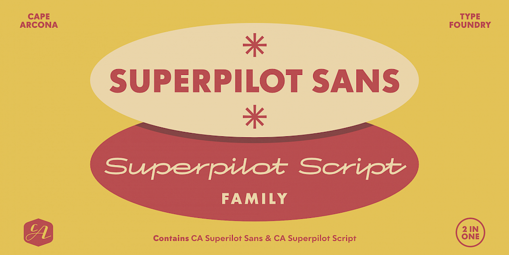
Introducing the Versatile CA Superpilot Sans & Script Typeface Duo
We are pleased to announce the arrival of the CA Superpilot Sans & Script typeface duo, a combination designed to inspire and support designers and creatives.
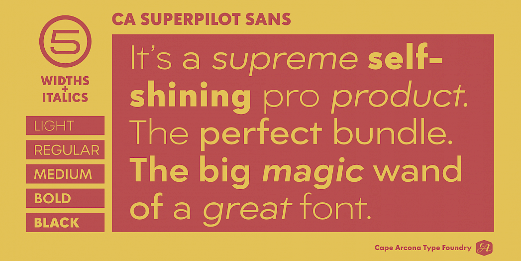
Let's explore the world of CA Superpilot Sans, a modern interpretation of the renowned Futura typeface. This typeface offers a sleek and contemporary option for those seeking a clean and adaptable typographic solution. With five weights and companion italics, CA Superpilot Sans offers great flexibility for a wide range of design projects. In addition, its extensive Central European character set and alternate glyphs ensure that your designs can transcend language barriers and make an impact wherever they are viewed.
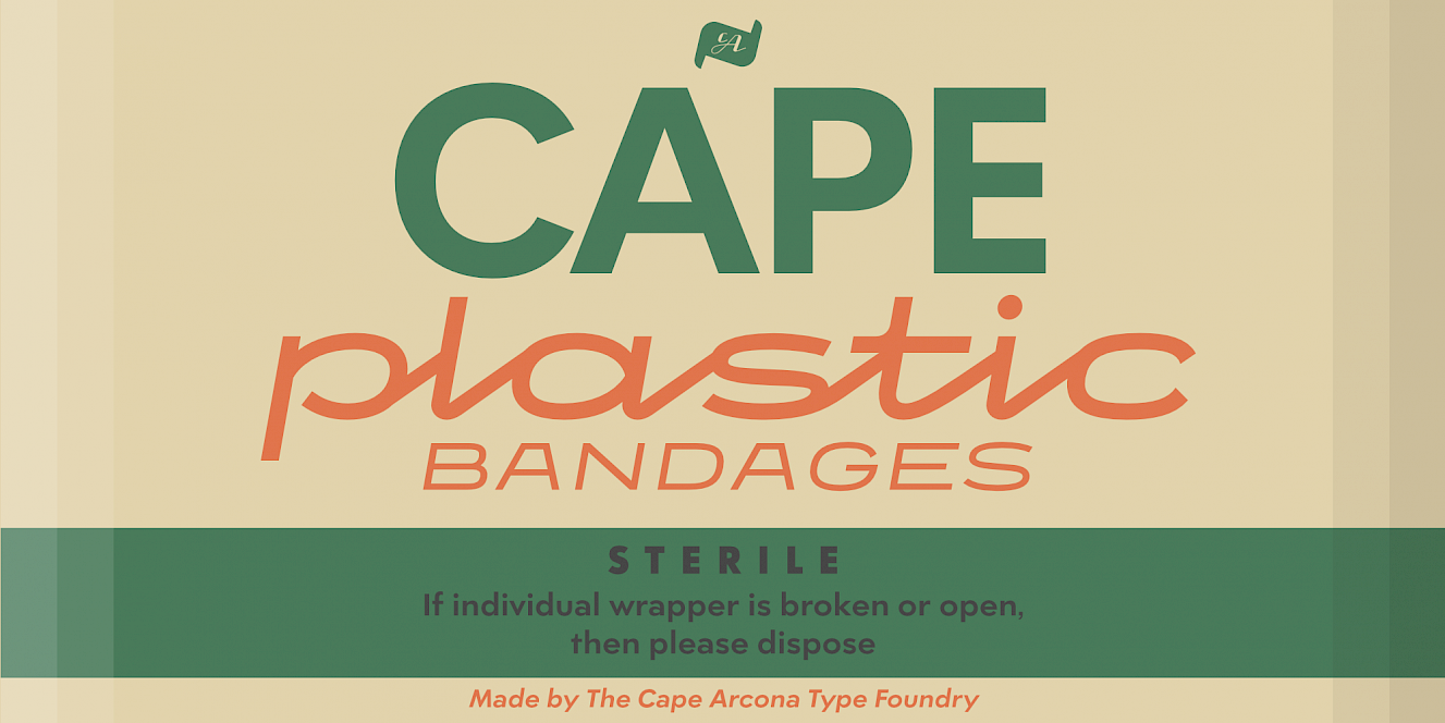
Now let's turn our attention to the captivating CA Superpilot Script fonts. Inspired by vintage camera equipment logos and typefaces from the 1950s, this monoline script font has a unique and nostalgic charm. With both regular and italic styles, CA Superpilot Script offers a variety of ways to add character and personality to your projects. Surprisingly, even when used in capitals, this script font commands attention and makes a bold statement. Its bold strokes and clean lines redefine the boundaries of script, allowing you to effortlessly create eye-catching headlines that leave a lasting impression.
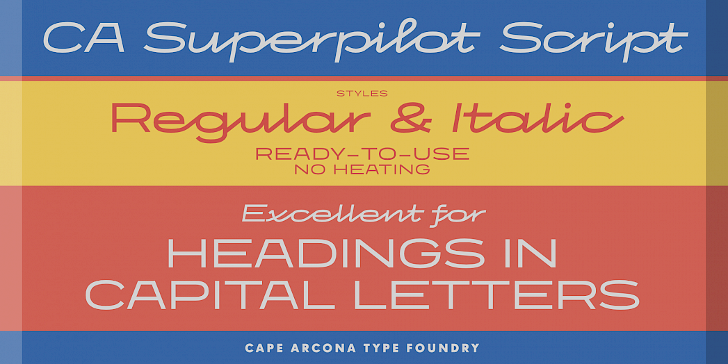
But the real power lies in the harmonious combination of CA Superpilot Sans and Script. Together, they form a versatile duo that unlocks an extraordinary level of flexibility to any design endeavor. Whether you're working on a branding project, developing a compelling website, or curating a stunning print design, the CA Superpilot Sans & Script duo is the ideal companion. This powerful combination allows your creativity to flourish without limits, ensuring exceptional results that will captivate audiences far and wide.
For more information and to purchase the CA Superpilot Sans & Script typeface duo, please visit www.cape-arcona.com/typefaces/ca-superpilot or contact us.
2022
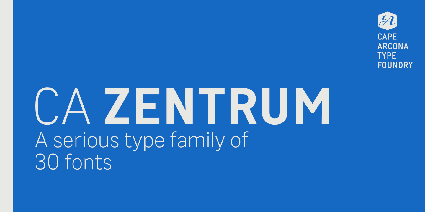
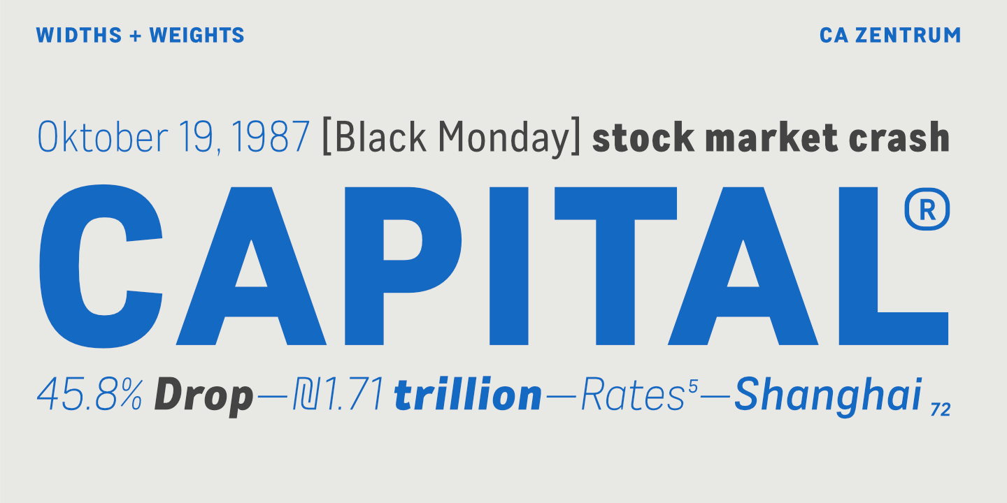
NEW: CA Zentrum font family
Our new typeface, CA ZENTRUM is now available!
Mostly suited for modern corporate visual languages, websites, corporate design, editorial design and advertising – with a set of five well-balanced weights and three widths. Available now at the Cape Arcona Type Foundry.
→ CA ZENTRUM
2022
Layered Fonts
This year we will continue the original tradition of the Cape Arcona Type Foundry and dedicate ourselves to the somewhat rough and unusual typefaces for which Cape Arcona has become famous. For lovers of clear sans serif typefaces, don’t worry, we have a lot of surprises in store this year. There will be something for everyone, we promise!
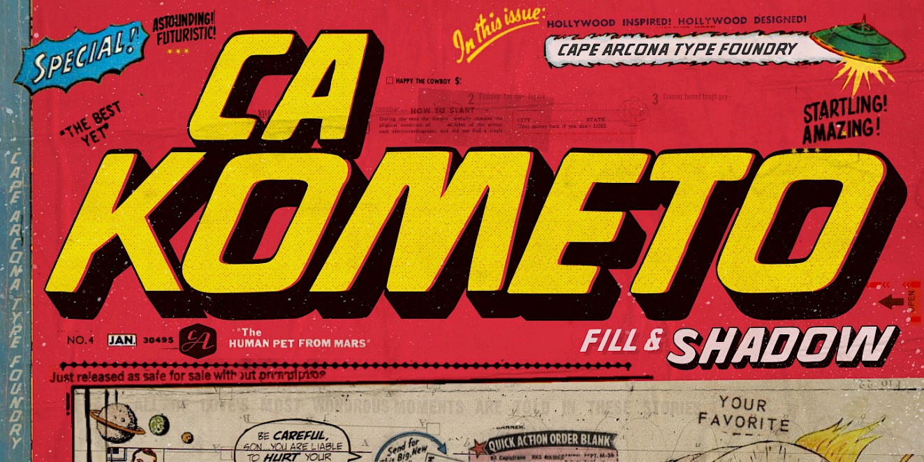
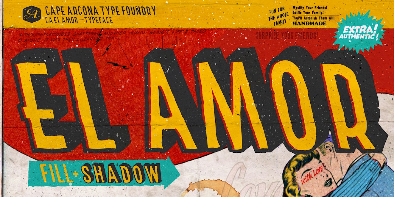
At the beginning of the week, we would like to draw your attention to the release of two fonts that were actually created for a bigger illustration job. Even though the use of these fonts is not the typical application of a layout artist, they are true pearls of the typographic subculture and may be used for special projects. Please do not set books with them. CA Kometo and CA El Amor are fonts that are based on several layers. The “Regular” is always the so-called shadow of the font, whereas the “Fill” style, as the name suggests, is for the fill.
The first two fonts published here are only the beginning, more will follow this year.
Have fun with it!