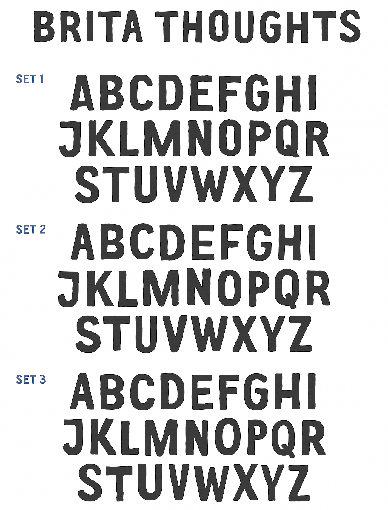
Brita Toughts
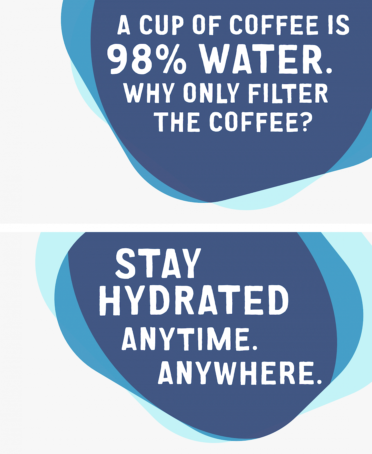
We were commissioned by Philipp und Keuntje (PUK), Hamburg, to develop a headline typeface for BRITA’s new corporate design.
The brief called for a slightly “grungy” typeface, loosely based on the forms of our CA Aires typeface. We developed an automatism for the creation of different grunge effects for the letters. These are available in three variants with slightly different degrees of deformation. To make the typeface look as natural as possible, we developed an OpenType feature for the typeface that ensures that different variants of the letters are always used when writing.
The result is a more organic typeface that matches the watercolor effects of the global campaign.