MONITOR LED (Deutsche Bahn)
Custom Typeface Family
Monitor LED — A custom font for Deutsche Bahn
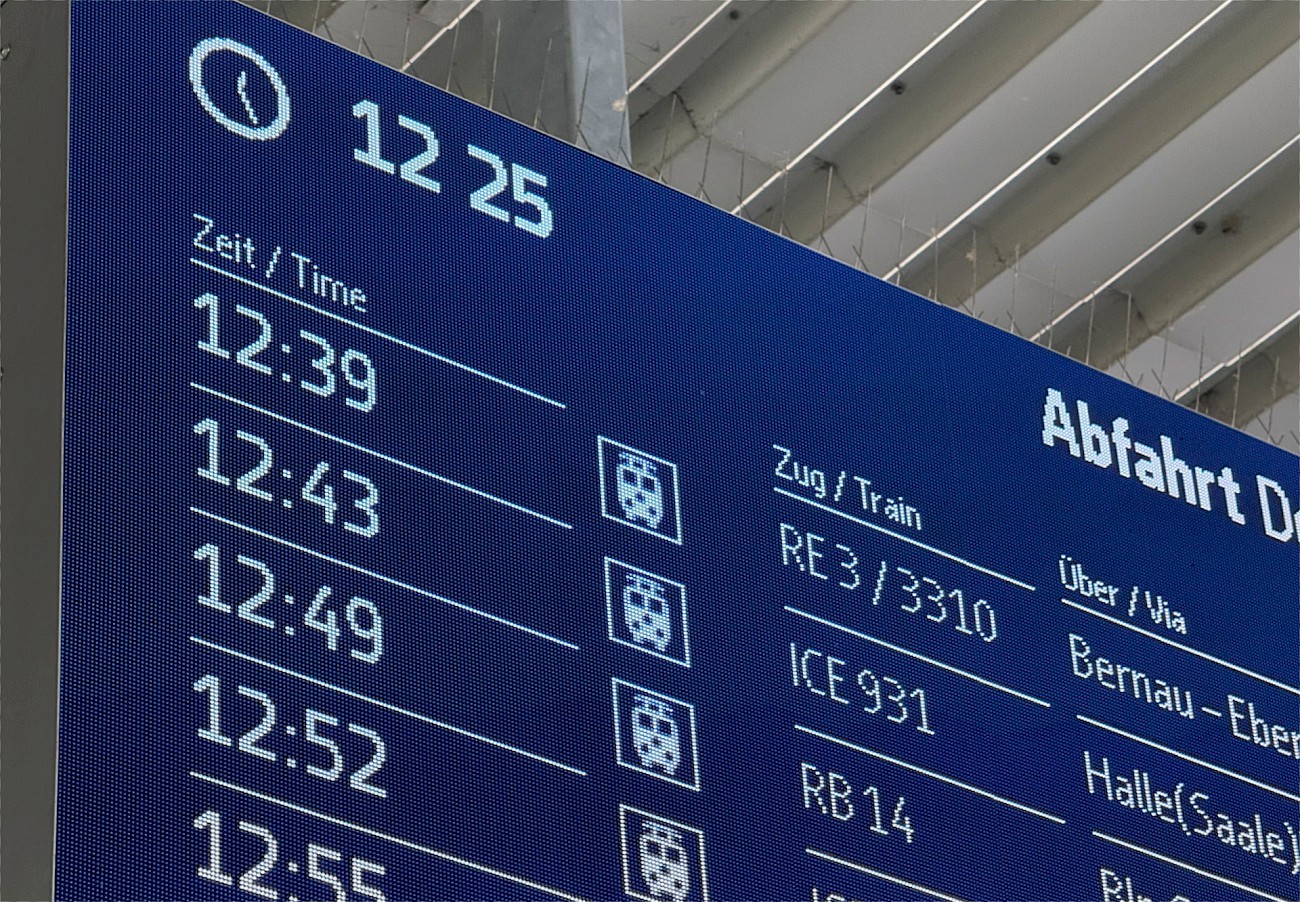
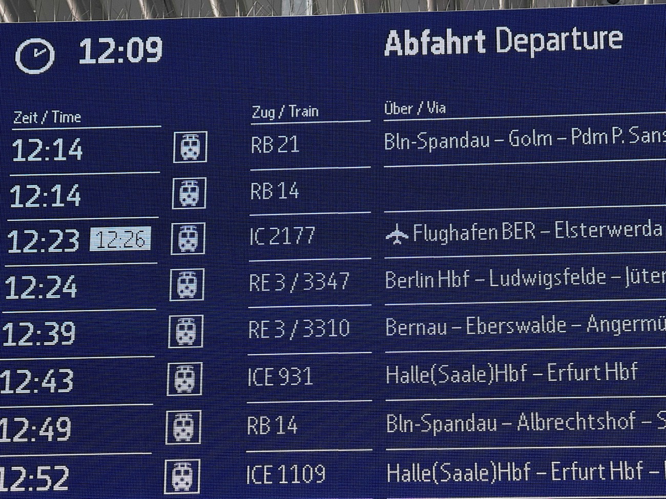
Deutsche Bahn commissioned a purpose-built type system for their nationwide LED display infrastructure: a family that would perform flawlessly across every screen format in their network, from compact platform indicators to the vast arrival boards of major terminals.
Germany's rail network never sleeps. Across thousands of platforms, concourses, and station halls, passengers glance up at departure boards, scan for departures, and navigate connections, often in under a second.
The Challenge
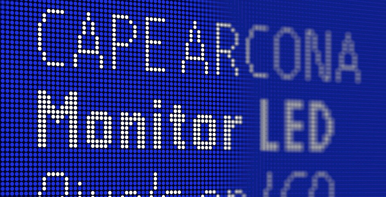
LED displays are unforgiving. Unlike print or screen rendering, pixel grids are fixed and coarse; a letterform either fits the grid or it breaks. Antialiasing doesn't exist. Subpixel tricks don't apply. What you get is what the hardware gives you, and nothing more.
The displays across the Deutsche Bahn network span an enormous range of pixel densities and physical dimensions. A solution that worked at one size would fall apart at another. Every variant had to be designed from scratch, on the grid, at the exact pixel count of the target display, not scaled, not interpolated, but drawn.
The Work
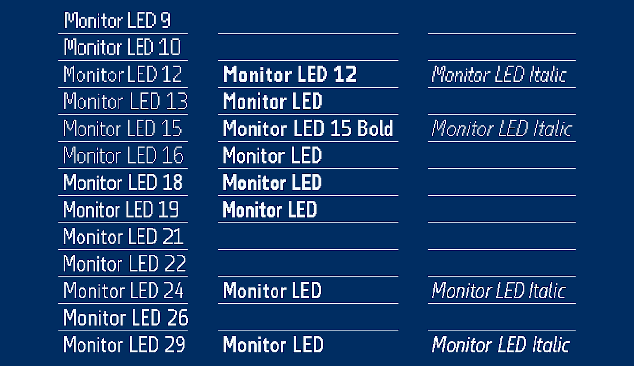
Monitor LED is a family of 13 cuts, each tailored to a specific display resolution and size class. Small enough for compact wayfinding modules. Large enough for the grand boards of Frankfurt Hauptbahnhof. Legible at distance, readable under flicker, clear under every lighting condition a German station can produce.
The foundation is Monitor, our own proportional typeface developed earlier for DB, adapted and rebuilt for the rigid logic of the LED matrix. Where Monitor breathes and flows, Monitor LED snaps. Every cut required careful decisions down to the pixel level: where to drop a diagonal, where to compromise a curve, where to sacrifice form to preserve readability at the only scale that matters.
Thirteen cuts. Thousands of individual character decisions. One brief: make sure passengers catch their train.
A lot of work. A lot of pixels. Exactly right.