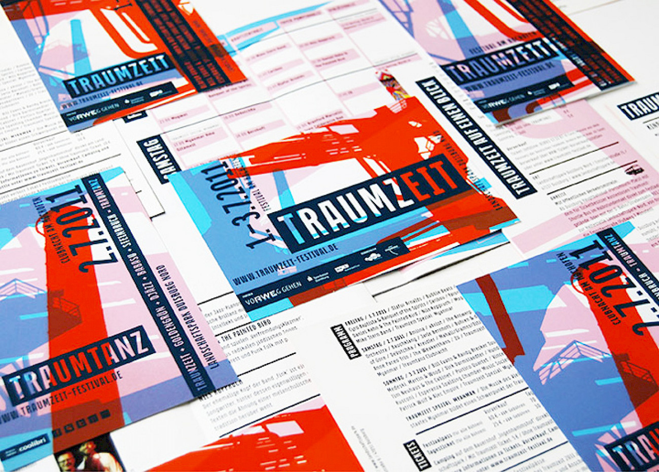
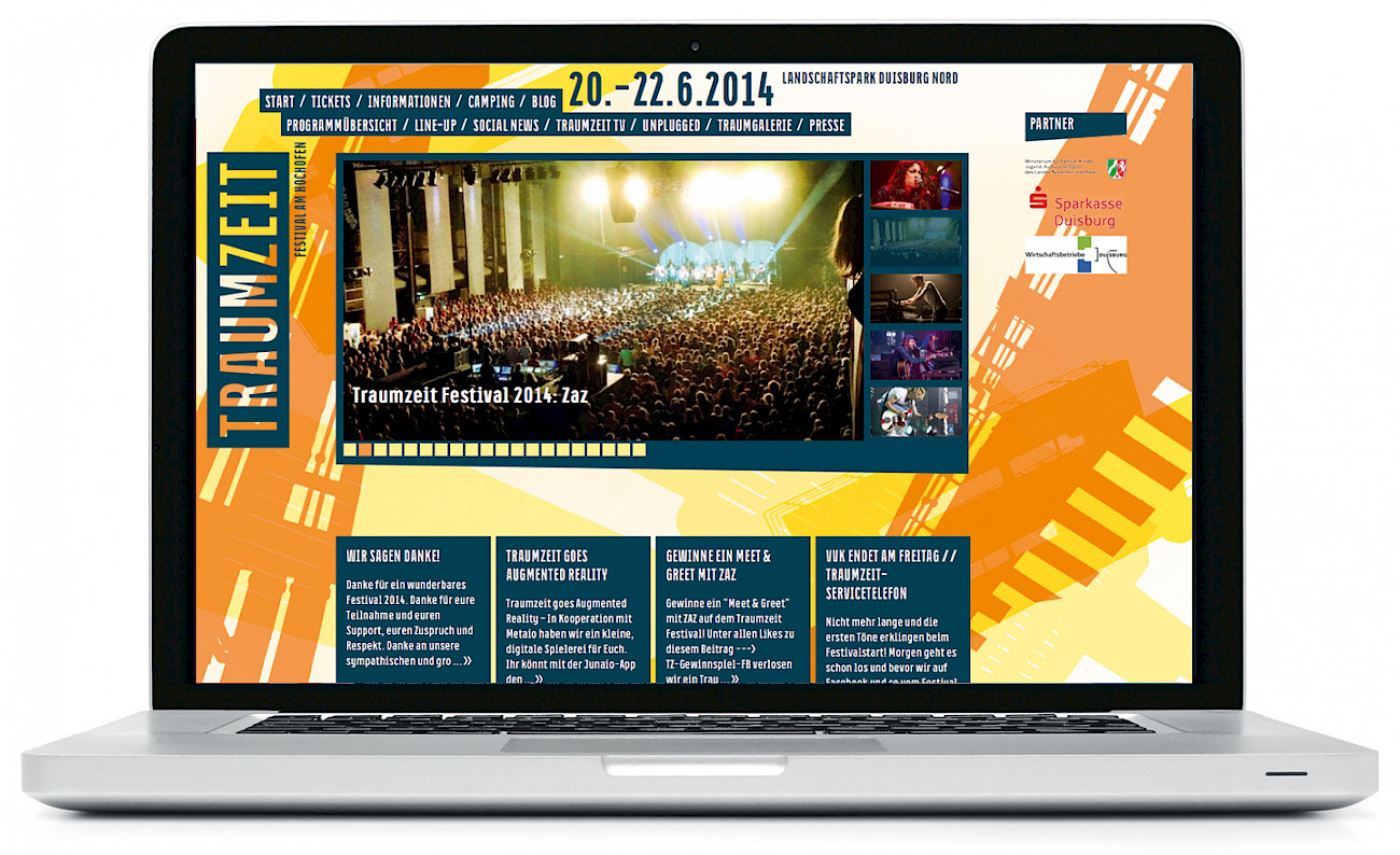
Traumzeit
Custom Typeface Family
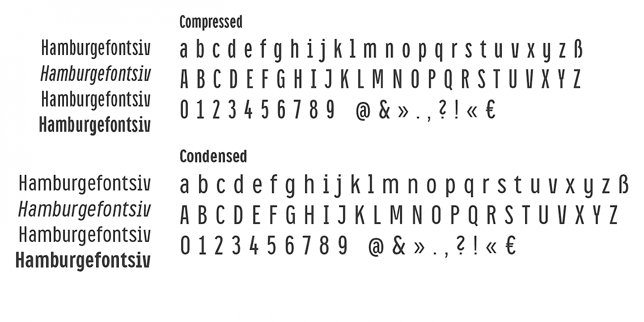
As part of the new corporate identity for the Traumzeit Festival, developed by Sichtvermerk, we designed a distinctive yet highly adaptable typeface. Building on the original logo concept, the process began with the creation of compressed capital letters intended for impactful headlines.
As the design proved effective, the typeface was further developed to include lowercase characters and a condensed weight suitable for body text. This evolution resulted in a fully functional type family featuring two widths and two weights. A key focus throughout the process was spatial efficiency, ensuring optimal performance across various applications.
The Traumzeit typeface combines industrial strength with approachable, rounded forms, capturing the festival’s spirit of fusion and diversity. The family was later expanded into what is now known as CA Oskar.