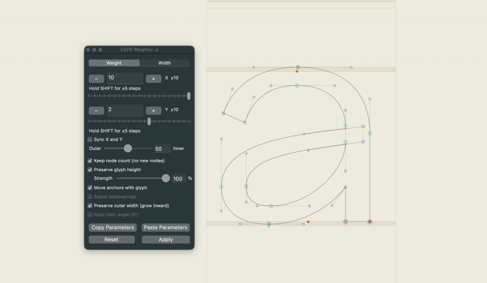
What It Does
CAPE Weightor works in two modes:
Weight mode makes glyphs bolder or lighter. You get two axes — X (vertical stems get thicker) and Y (horizontal strokes like crossbars and serifs get thicker). You can move both independently, or lock them together. The glyph height is automatically preserved, so your cap heights and descenders stay consistent.
Width mode condenses or expands a glyph horizontally without changing its weight. A regular horizontal scale would also thin the stems — not useful. Weightor compensates for that automatically by running an offset curve pass after the scale, restoring the stems to their original thickness. The result: narrower or wider shapes, same weight.
The Outer / Inner Slider
One detail that makes a difference in practice: the Outer / Inner slider in Weight mode controls where the added weight lands.
- At 50 (default) the weight grows symmetrically — both the outer silhouette and the inner counters expand equally.
- At 0 the counters stay put and the outer silhouette grows.
- At 100 the outer silhouette stays put and the counters shrink inward.
A value around 30–40 tends to look better optically than the default 50, because counters stay a little more open at heavier weights.
Path Mode — Change Only What You Select
One of the newer features: if you select one or more paths (or nodes) in the edit view before adjusting the sliders, Weightor applies the change to those paths only. Everything else in the glyph stays untouched.
This is useful for fine-tuning specific parts of a letter — making just the crossbar of an H heavier, or adjusting a single counter — without touching the rest of the outline.
A Few Things to Know Before You Start
This is not an "auto bold" button that produces production-ready results. Geometric fonts and simpler designs respond well. Fonts with lots of diagonal strokes, optical corrections, or ink traps will need cleanup by hand afterwards. Think of it as a strong starting point, not a finished result.
A few practical notes:
- Run it on base glyphs. Composite characters like ä, ñ or é inherit the changes automatically through their components — that's the correct workflow.
- Components inside a glyph are never modified. Only the actual outline paths are changed.
- Purely horizontal glyphs like minus or macron need Preserve Height unchecked, otherwise the Y slider appears to do nothing (the rescaling step cancels it out).
Where to Get It
CAPE Weightor is free and open source. You can install it directly via the Glyphs Plugin Manager — search for Cape Weightor — or grab the source from GitHub.
It requires Glyphs 3.5 or later. No extra dependencies are needed.