2022
Layered Fonts
This year we will continue the original tradition of the Cape Arcona Type Foundry and dedicate ourselves to the somewhat rough and unusual typefaces for which Cape Arcona has become famous. For lovers of clear sans serif typefaces, don’t worry, we have a lot of surprises in store this year. There will be something for everyone, we promise!
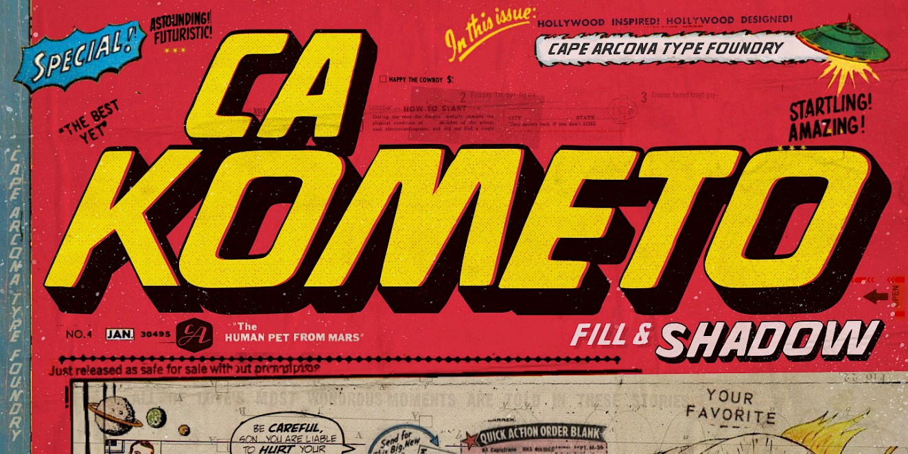
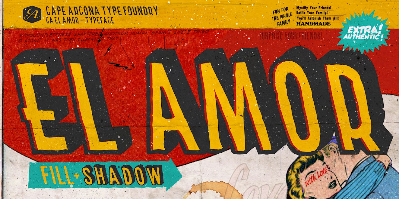
At the beginning of the week, we would like to draw your attention to the release of two fonts that were actually created for a bigger illustration job. Even though the use of these fonts is not the typical application of a layout artist, they are true pearls of the typographic subculture and may be used for special projects. Please do not set books with them. CA Kometo and CA El Amor are fonts that are based on several layers. The “Regular” is always the so-called shadow of the font, whereas the “Fill” style, as the name suggests, is for the fill.
The first two fonts published here are only the beginning, more will follow this year.
Have fun with it!