

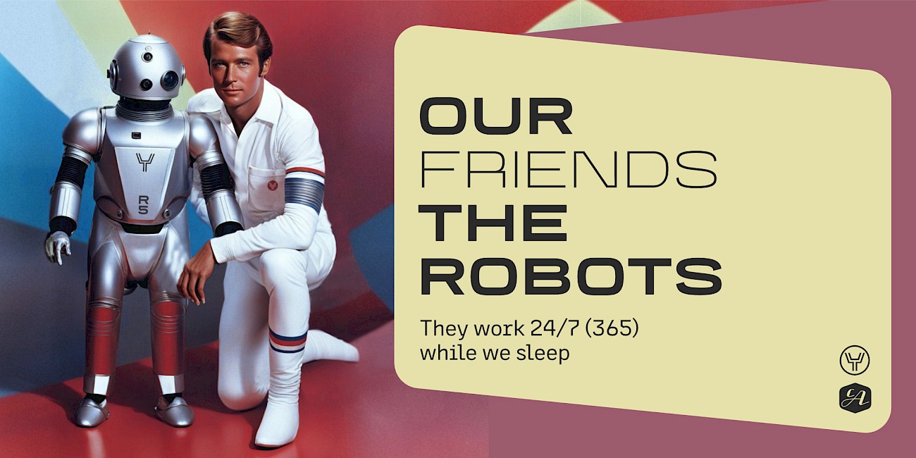
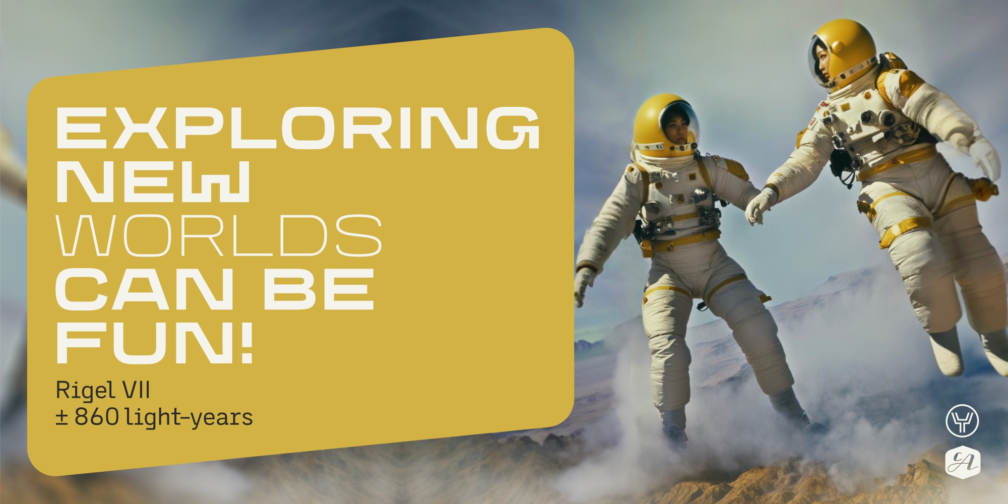
Are you ready to elevate your sci-fi, action, and military movie and series projects? Our font family brings a touch of nostalgia and a dash of modernity to your titles and typography. With CA YOSHIRO “Wide” style, you got striking similarities to the iconic Eurostile font from the 1960s, and it creates an instant feeling of familiarity. However, what sets it apart is its contemporary, fresh sci-fi design.
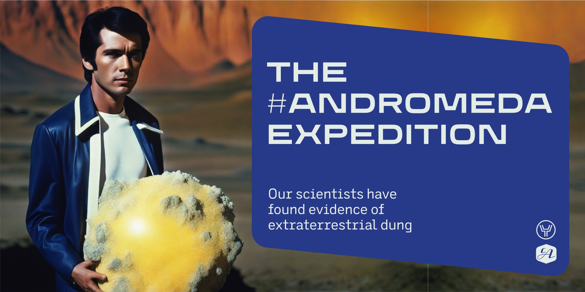
It’s the perfect blend of classic and cutting-edge, delivering an unprecedented, unconstrained style that promises to captivate audiences like never before. The CA YOSHIRO “Normal” style can also be used for various other projects that need a normal width and should just show a light technical touch without immediately pointing out a reference to sci-fi.
Designed by:
Thomas Schostok
Styles: 10
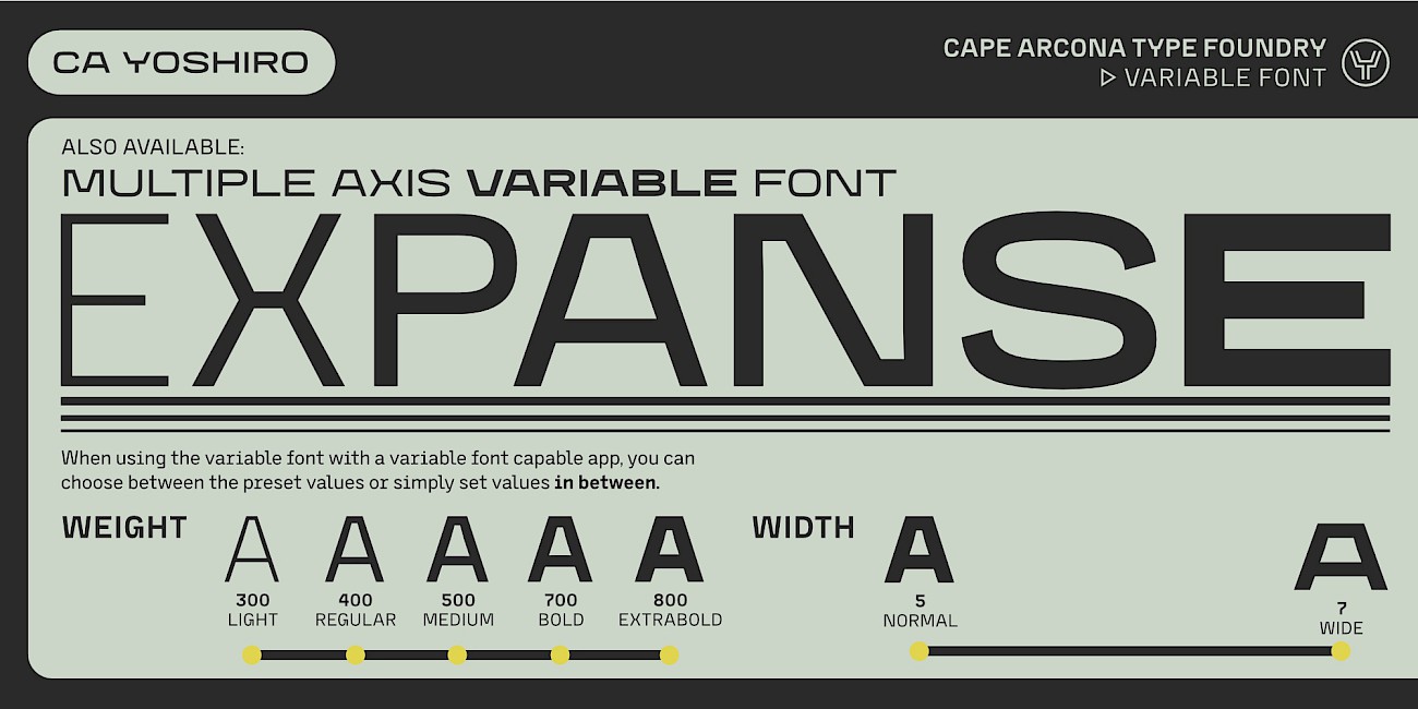
+ Variable Font
Supported Languages:
Central European encoding
Latin Extended encoding
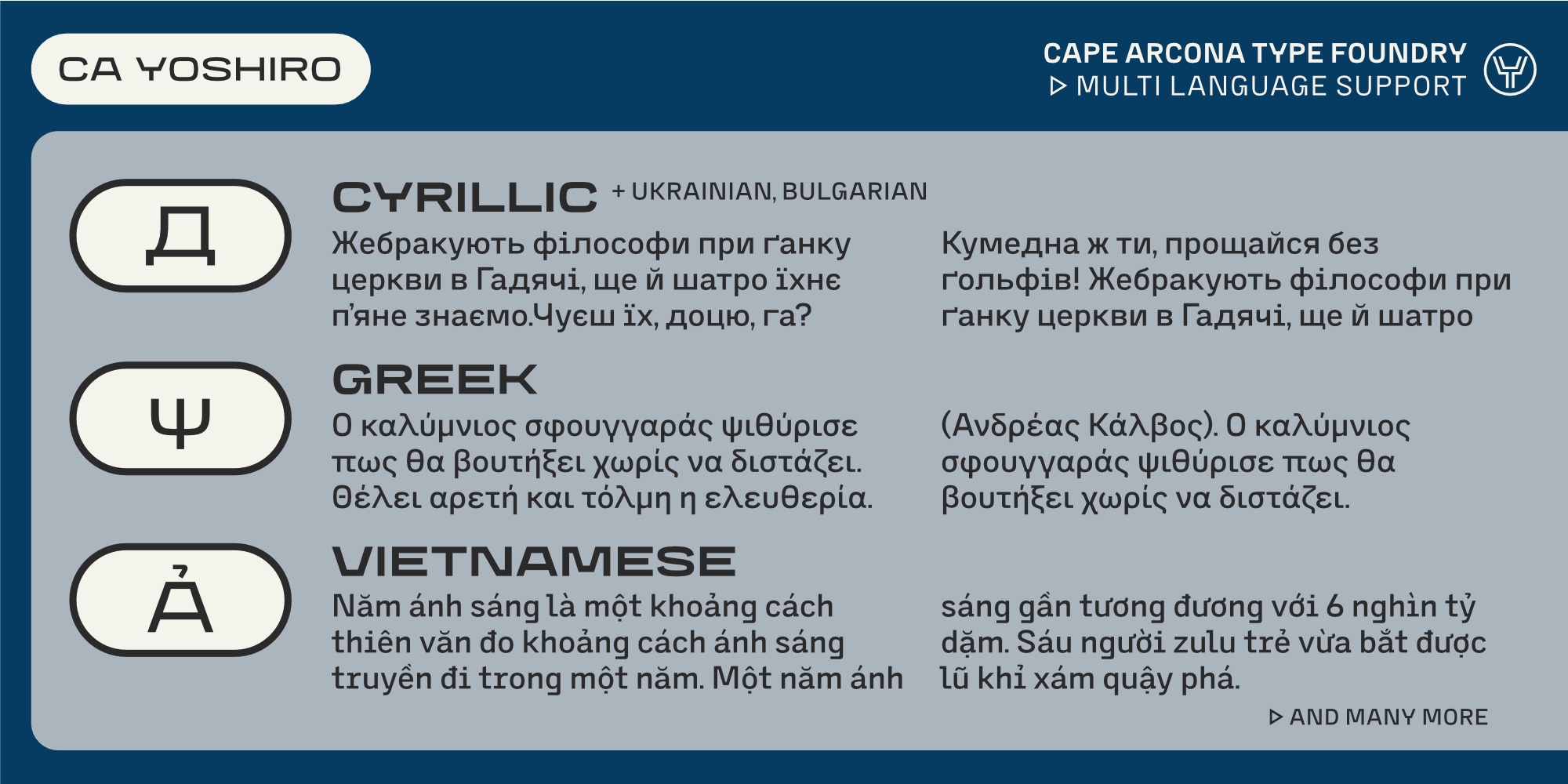
Cyrillic encoding
Greek encoding
Western encoding
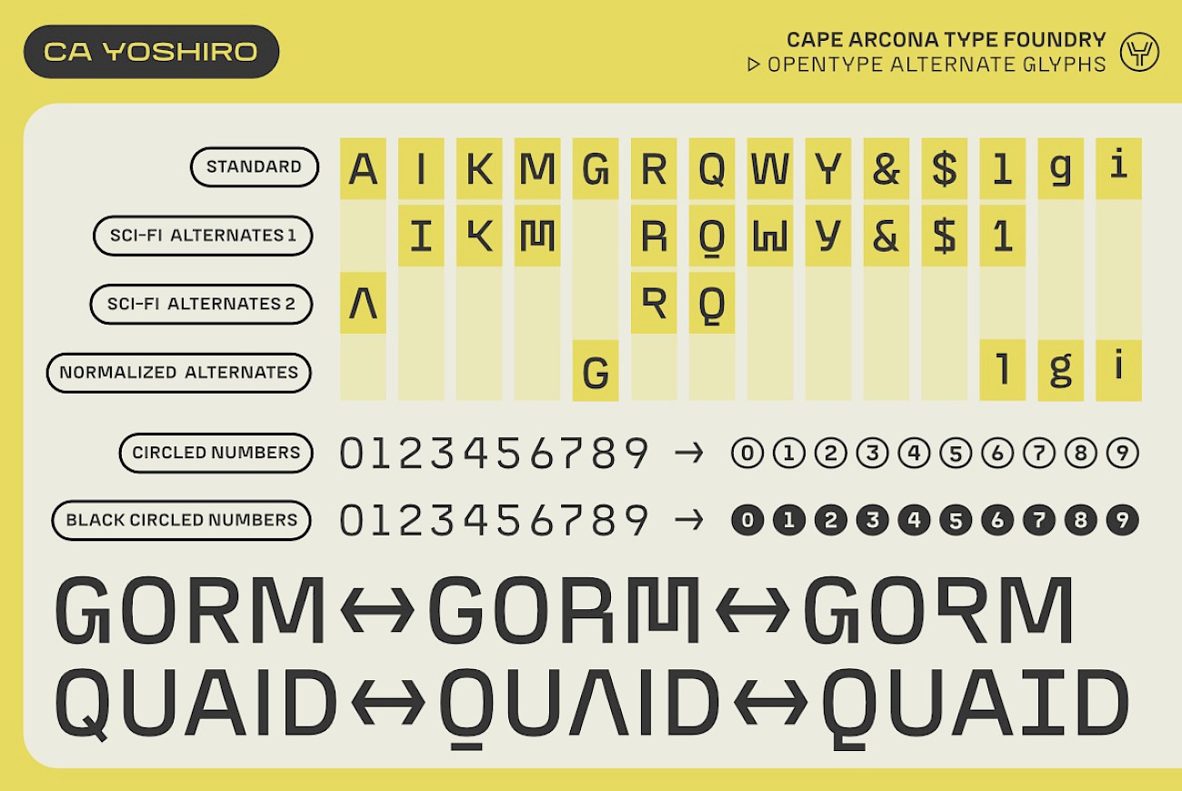
OpenType Features:
Stylistic sets (ss0x)
Stylistic alternates (salt)
Fractions (frac)
Ordinals (ordn)
Proportional lining (pnum+lnum)
Tabular lining (tnum+lnum)
Contextual alternates (calt)
Superiors / Inferiors (subs/sinf)
Slashes zero (zero)
Discretionary ligatures (dlig)
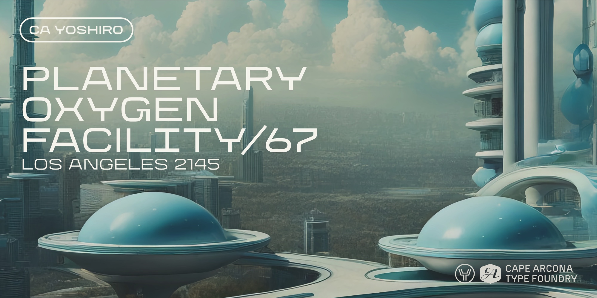
The inspiration for CA YOSHIRO was planted by a recurring theme in the world of military, action, and sci-fi films and series. It’s no secret that these genres have long been associated with iconic typefaces such as Eurostile (1962) and Microgramma (1952). While these fonts have left an indelible mark on the industry, they’re not without their shortcomings.
One persistent problem we observed was the distortion of these fonts to achieve desired sizes. Stretching and compressing fonts, while sometimes a practical necessity, often resulted in compromised design quality. It was clear that a modern alternative was needed. One that could stand up to its predecessors and offer a solution to these design pitfalls.
Our mission was clear: to create a typeface that would offer versatility through a variety of letter widths that were defined by different styles. This led to the introduction of a variable font—a game-changer. Designers can now take control and adjust the thickness and width as needed to correct past design missteps. Inspiration came from a commitment to continuity. We made sure that CA YOSHIRO’s maximum width has been adapted to the Eurostile Extended, preserving the established typographic essence of movies, series and games in these genres.
From a design perspective, we wanted a typeface that would embrace the future while remaining adaptable for a variety of applications. The result? A type family that spans the spectrum from futuristic to timeless. It includes extended styles for a sci-fi flair and normalized styles that excel even in body text. Designers now have a versatile tool for expressing their creative vision and creating typography that sets new standards, not just for one project, but for many to come.
Design Freedom: Customize Letter Widths with Ease!
Unlock endless possibilities with our Variable Font feature! We understand that every design project is unique. That’s why we’ve gone the extra mile to give you more flexibility. In addition to the standard letter width, our font family also offers a Variable Font option. This allows designers like you to freely adjust the width of the letters to create the perfect fit for any application. You can maintain a consistent design style while tailoring the width to your exact needs, whether it’s for opening titles, posters, different sized streaming provider covers, or any other creative endeavor.
Tailored Typography: Futuristic and Normalized Variants at Your Fingertips!
Unleash your creativity with our font’s versatile character options! We understand that every project requires a unique touch, so we’ve carefully crafted a type family that offers a wide range of choices. You’ll find futuristic styles that add a touch of sci-fi flair, as well as regular styles that are perfect for body text.
Imagine the possibilities: you can seamlessly switch between these variants to steer the typographic impression in the direction you want. Create captivating headlines with a futuristic edge or body text that exudes sophistication and readability. With our typeface family, you’re in complete control of the narrative, making your design journey a breeze.
Combining elegance with code: The perfect blend of monospace and legibility!
In addition, our family has subtle similarities to the monospace fonts commonly used on computer displays and screens. These fonts are the foundation of written programming code and sequences, lending a distinctive character to the digital realm.
But here’s the twist: While our family is inspired by monospace fonts, it is not limited to monospacing. It stands out as a non-monospaced typeface designed for superior legibility and aesthetics. This fusion of influences creates a typeface that bridges the gap between the digital and cinematic worlds, giving you an unparalleled, legible, and compelling typeface for your projects.

Specimen
Characters, features, etc.
Download PDF
Trial fonts
Trial fonts for non-commercial use
Download
End User License Agreement
By downloading and/or installing CAPE ARCONA TYPE FOUNDRY fonts software, you acknowledge you have fully read and understood all terms within our EULA.
TRIAL/TEST FONTS
With a free trial license, you can use our test fonts to decide if you want to purchase a license.
FREE FONTS
Free fonts are free for all non-commercial uses. If you intend to use it in a commercial way, you need to buy a commercial license.