


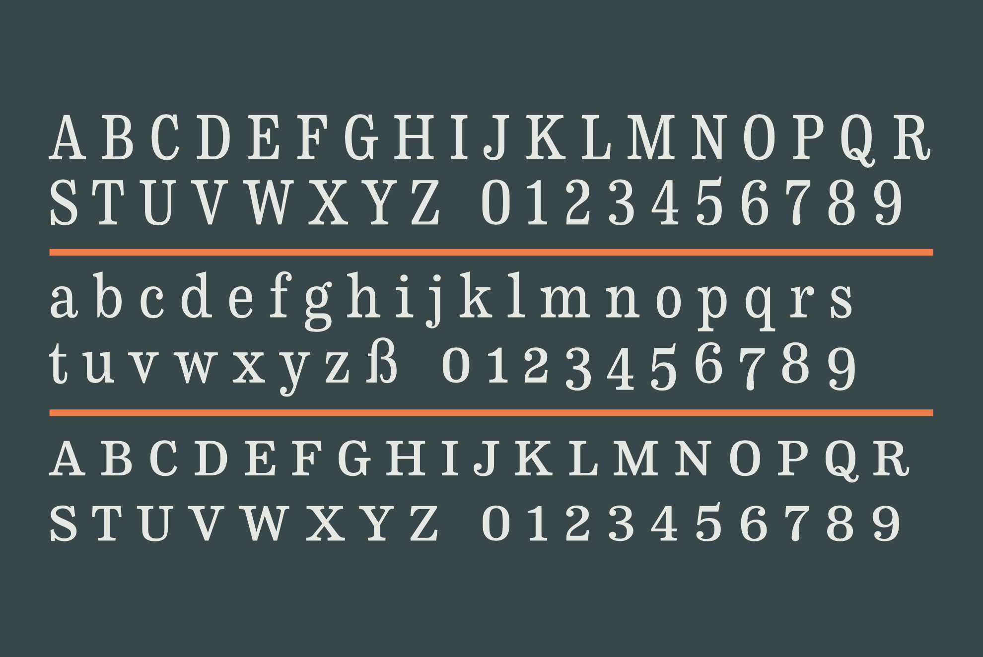
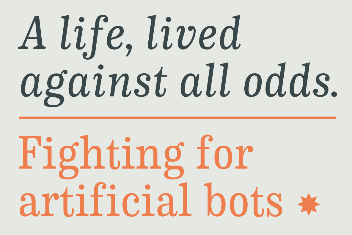
CA Normal Serif is the perfect companion to its grotesque brother, CA Normal. But it is not just a serif style equivalent. It has a character of its own while preserving the principal proportions and the idea of quirkiness. It was not the aim to build a typeface that can immediately be identified as a relative of CA Normal. The intention was to create a matching typeface in aspects of aesthetics and concept. Whereas commonly serif companions to grotesques are old-style or slab-serif, CA Normal Serif is situated between modern and slab-serif typefaces.
It picks up elements of classic newspaper type as brought to us by Chauncey H. Griffith’s legibility group, sharing the flavor of abrasive details and “slabbish” serifs. But the proportions are more condensed than those of its predecessors, giving it a bit more elegance, which moves it closer to the aesthetic of scotch romans.
Designed by:
Stefan Claudius
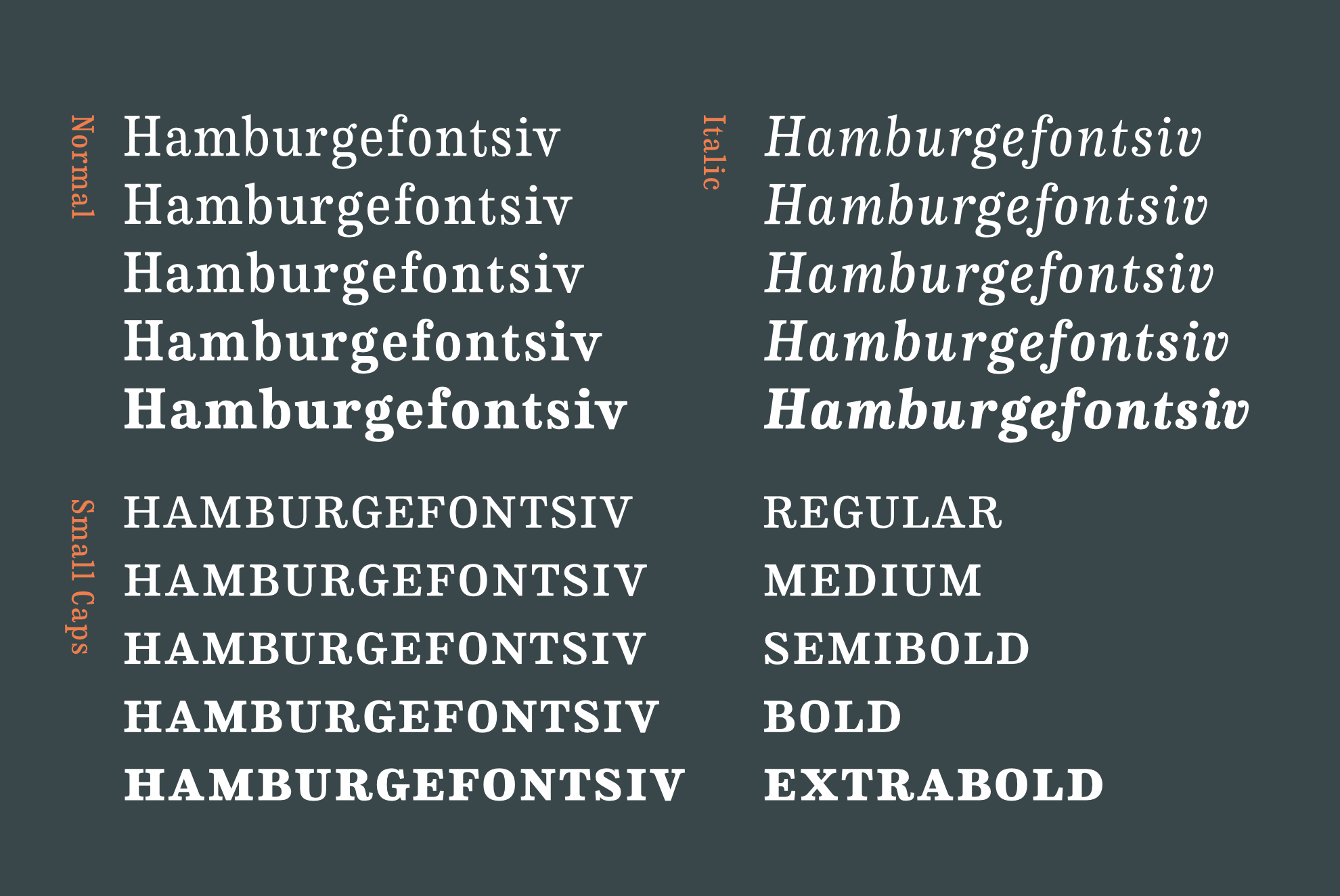
Styles: 10
Supported Languages:
Western encoding
Central European encoding
Specimen
Characters, features, etc.
Download PDF
Trial fonts
Trial fonts for non-commercial use
Download
End User License Agreement
By downloading and/or installing CAPE ARCONA TYPE FOUNDRY fonts software, you acknowledge you have fully read and understood all terms within our EULA.
TRIAL/TEST FONTS
With a free trial license, you can use our test fonts to decide if you want to purchase a license.
FREE FONTS
Free fonts are free for all non-commercial uses. If you intend to use it in a commercial way, you need to buy a commercial license.