


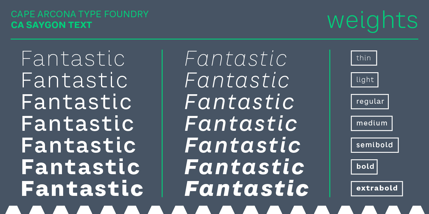
CA Saygon Text was developed as a sibling to CA Saygon to have a less eccentric alternative for setting larger quantities of text. The basic forms and proportions of Saygon were adopted and continued in such a way that a straight font family from Thin to Extrabold resulted. A fundamental inspiration were early static grotesque typefaces such as Akzidenz Grotesk. Nevertheless, the typeface was by no means intended to have a historical look.
Thus, a relatively high x-height was chosen, which makes the typeface quite economical in typesetting, since the letters appear visually larger. A relatively small line spacing with good legibility can be achieved due to the small ascenders and the low cap height. Letters like f and t, which otherwise tend to end in curves, were given right angles. This on the one hand meets certain design elements of the original Saygon, but on the other hand also refers to contemporary trends in typeface design.
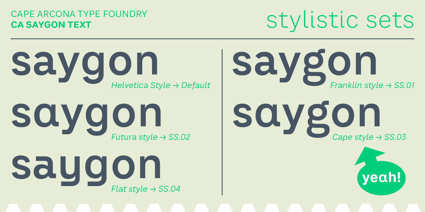
A special feature are the five styles in which CA Saygon Text can be used. The basic setting is the Helvetica style, with a two-storey a and g. The Futura style has a single-storey a and a two-storey g accordingly. The third style with two-storey a and three-storey g is called the Franklin style. But the real highlight is the Cape style with a single-storey a and three-storey g – a real rarity. If you like it even more progressive, you should try the Flat style, which continues the right angles in a, g, and y as well.
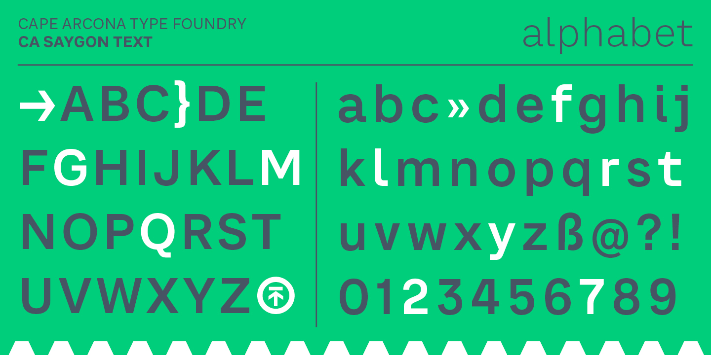
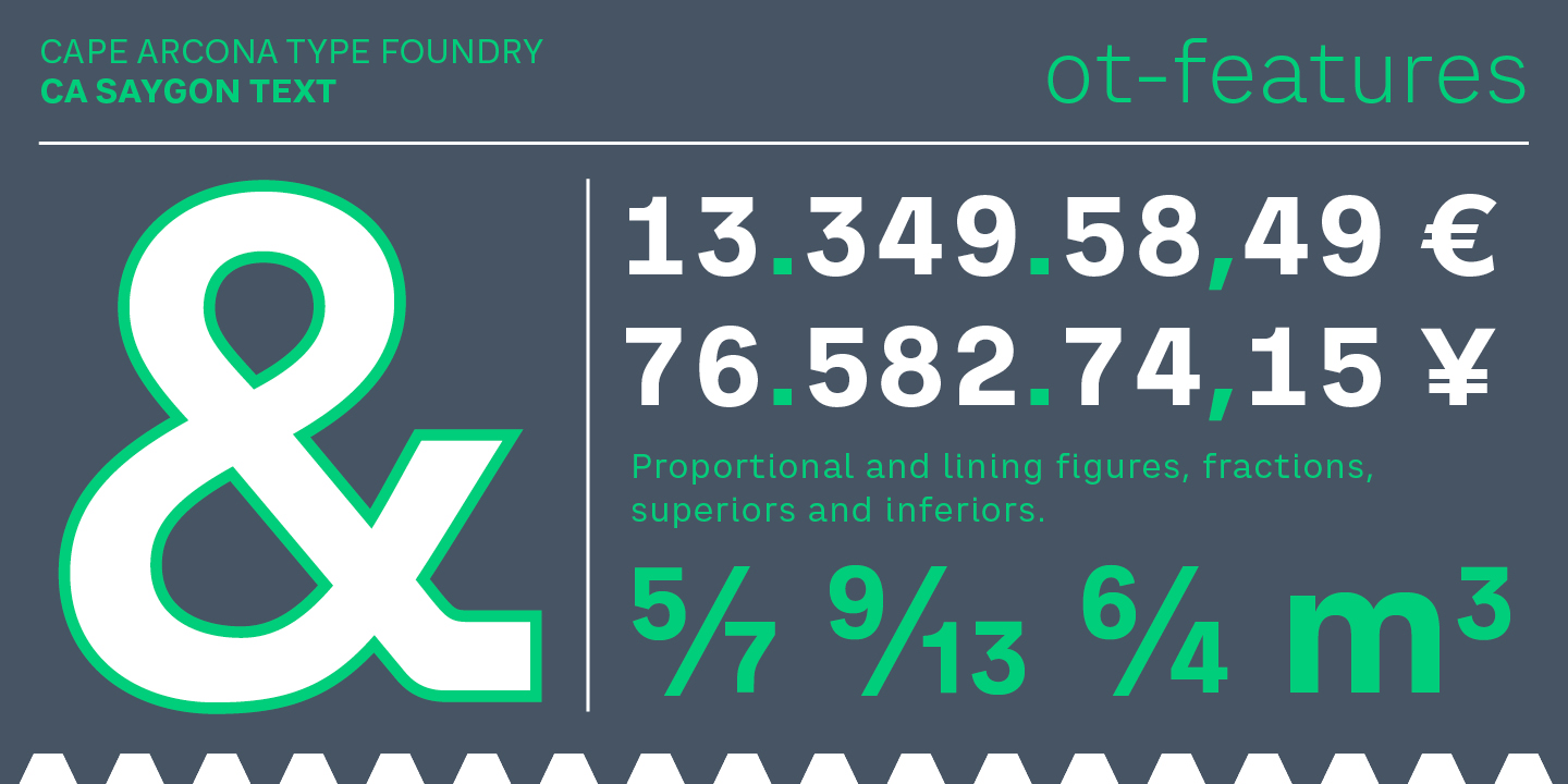
Thanks to the Latin Extended and Cyrillic character sets, a huge language area is covered that even extends to Vietnam! Even the exotic German uppercase-double-s is available and appears automatically when typed between other capital letters. Numerous OpenType features make life easier for the professional typographer: there are fractions, superscript and subscript numbers, as well as proportional and tabular capitals. The spacing and kerning was carried out by Igino Marini, who, with a trained eye and his iKern program, has become the benchmark in typeface finishing.
Designed by:
Stefan Claudius
Styles: 14
Supported Languages:
Western encoding
Central European encoding
Cyrillic encoding
OpenType Features:
Stylistic alternates (salt)
Contextual alternates (calt)
Stylistic sets (ss0x)
Fractions (frac)
Ordinals (ordn)
Tabular lining (tnum+lnum)
Proportional lining (pnum+lnum)
Superiors / Inferiors (subs/sinf)
Specimen
Characters, features, etc.
Download PDF
Trial fonts
Trial fonts for non-commercial use
Download
End User License Agreement
By downloading and/or installing CAPE ARCONA TYPE FOUNDRY fonts software, you acknowledge you have fully read and understood all terms within our EULA.
TRIAL/TEST FONTS
With a free trial license, you can use our test fonts to decide if you want to purchase a license.
FREE FONTS
Free fonts are free for all non-commercial uses. If you intend to use it in a commercial way, you need to buy a commercial license.